Productivity that works with your mind, not against it.
Role
Lead Designer
Type
Mobile Application
Year
2026
Tools
Figma · Nunito · Warm System
Overview
6
Core screens
5
Inner Council voices
1
Unified workspace
Offline
First architecture
Your tools manage tasks. Flowspace manages you.
Flowspace is an integrated productivity environment where tasks, reflections, and ideas live in one unified workspace and where the app adapts to your mental state rather than demanding you perform at a fixed capacity every day.
The core insight
Most productivity tools ignore the user's mental state entirely. Flowspace makes energy the primary input, not an afterthought.
The Problem
Productive tools, unproductive experience.
01
The mental state gap
Every productivity tool assumes you show up the same every day. They don't account for exhaustion, anxiety, or low focus, so on hard days, the tool becomes another source of pressure rather than support.
02
Scattered thinking
Ideas live in notes apps. Tasks live in To-do-lists. Reflections live in a journal. Decisions get made in your head at 2am. The fragmentation creates cognitive overhead that defeats the purpose of being organised.
03
Generic advice at critical moments
When users face real dilemmas, a career decision, a creative block, a conflict, productivity apps offer nothing. The tools that are supposed to support your thinking abandon you exactly when you need them most.
Design Process
Designing for energy, not just output.
Discover
I spoke to people who considered themselves "organised" but still felt overwhelmed. The recurring theme: the tools worked, but the people using them didn't always. Energy fluctuated. Motivation dipped. The todo list stayed the same whether you slept four hours or eight.
Define
The design challenge reframed itself: don't build a better task manager, build an environment that responds to the human using it. The primary input became energy level, not just due date. Everything else flowed from that decision.
Ideate
The Inner Council concept emerged from asking: what if the app could think about your situation the way a wise friend would? Not a chatbot with generic prompts, but five distinct perspectives, each with a different lens, drawing from your actual logged patterns, mood, and energy to give genuinely contextual responses.
Prototype
The warm burgundy and amber palette was a deliberate departure from productivity app convention (blue, white, minimal). Flowspace needed to feel like a private space, warm, considered, slightly intimate. The colour system reinforced the emotional purpose of the product.
Validate
Testing surfaced one critical insight: users trusted the energy-based task suggestions immediately, but needed to understand *why* a task was recommended. Adding the energy cost indicator per task, visible before you commit, resolved the hesitation and made the system feel transparent rather than prescriptive.
Key Design Decision
The Inner Council isn't a chatbot. It's five distinct perspectives, each with a name, a voice, and a point of view, that draw from your actual logged life to speak with context. That distinction changed everything about how users engaged with it."
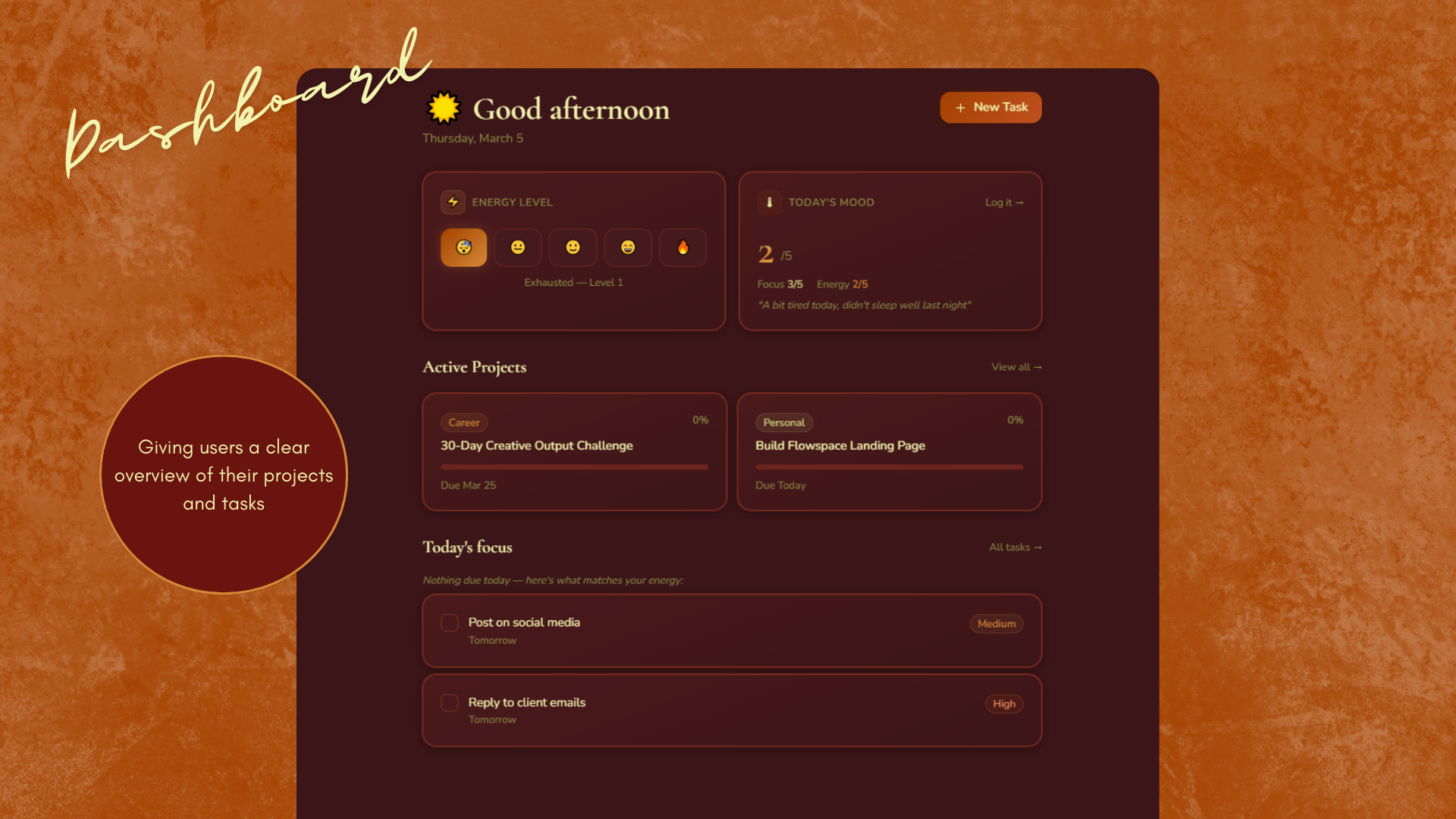
01 — Dashboard
The day starts with two questions: how's your energy, and what's your mood? Flowspace uses those inputs to surface the right tasks from your active projects, not everything on your list, just what you can realistically tackle today. Active projects and a focused task list sit below, shaped by what you told the app you have capacity for.
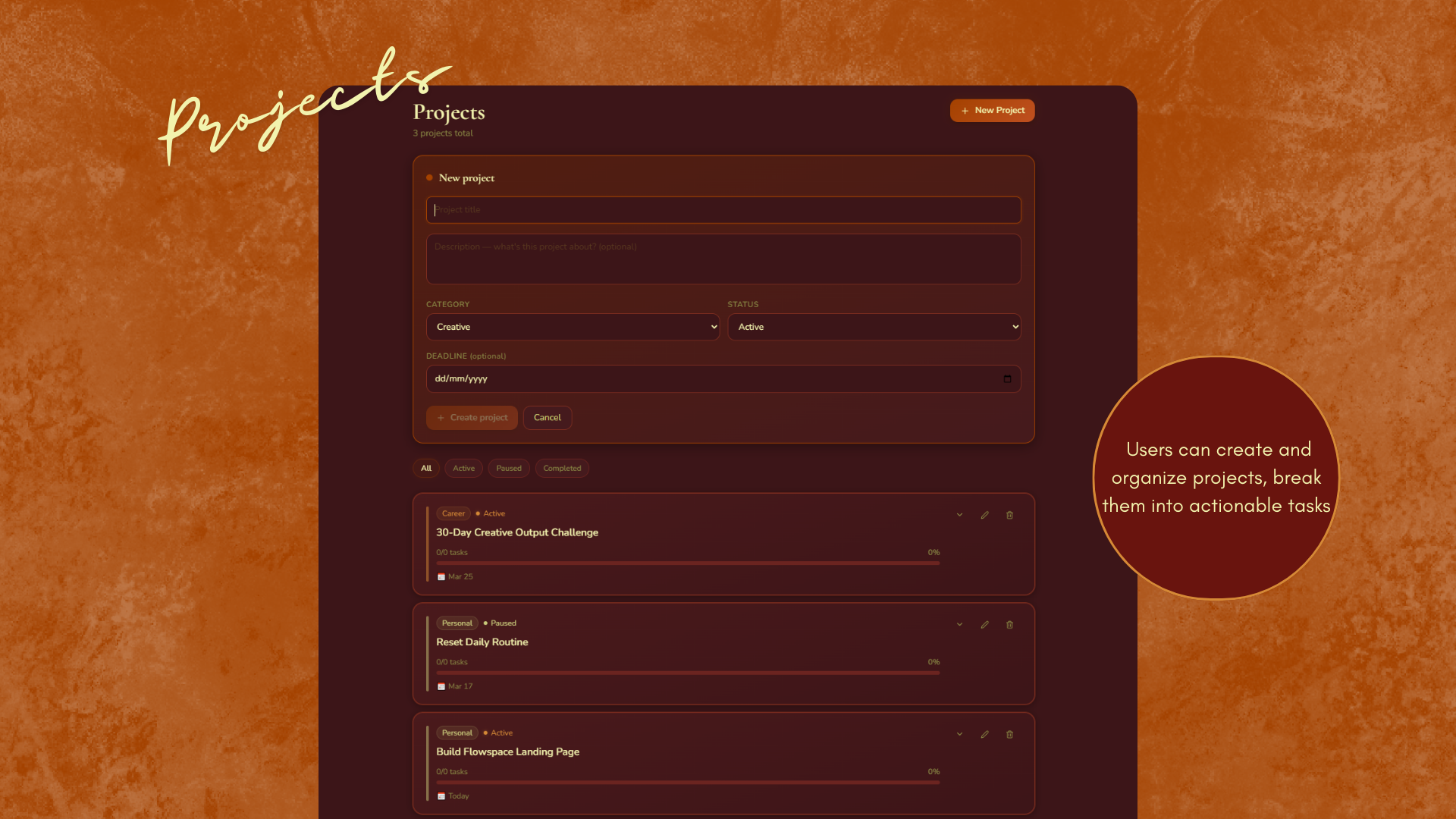
02 — Projects
All your projects in one view, filterable by status, All, Active, Paused, Completed. Projects are categorised as Career, Personal, Creative, or Learning, giving you a picture of where your effort is actually going across life areas, not just work.
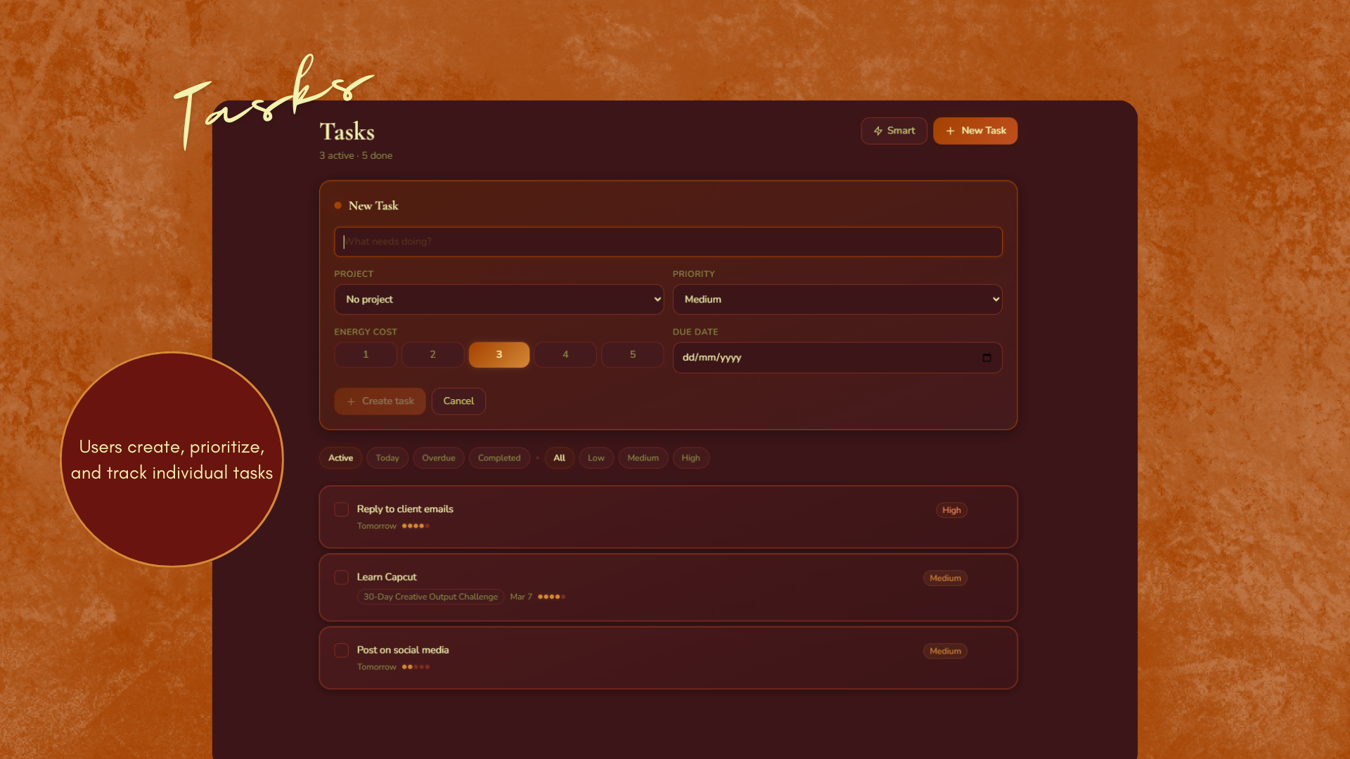
03 — Tasks
Tasks show their energy cost before you commit. Overdue items surface clearly without shame, just clarity. The app also suggests tasks based on your logged energy for the day, so when you're running low, it steers you toward lighter work rather than letting you stall on something that needs your full capacity.
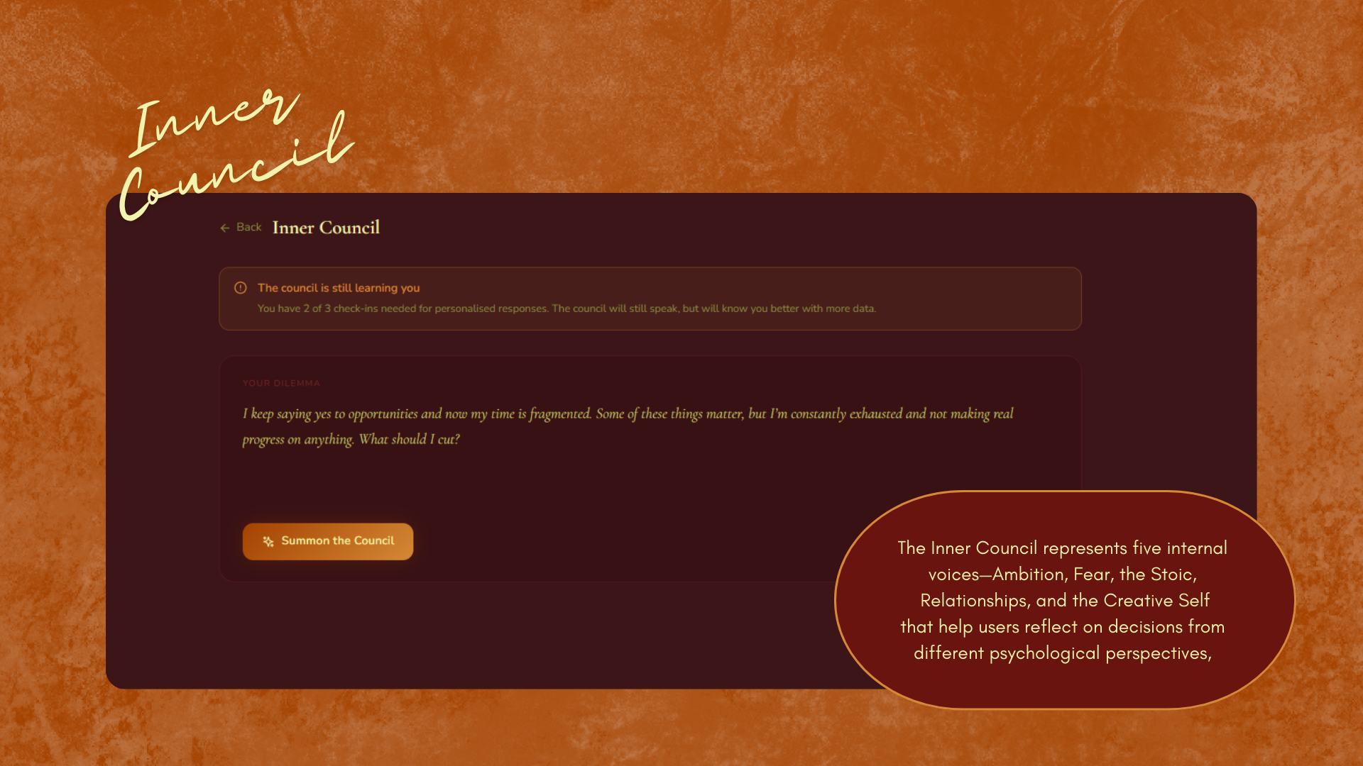
04 — Inner Council
Five inner voices. One clearer path. The Council isn't a generic AI assistant, each voice brings a distinct perspective to your dilemma, drawing from your energy, mood patterns, and recent logs. You come with a real question. You leave with a real answer. This was the feature users described as 'unlike anything else they'd used.'
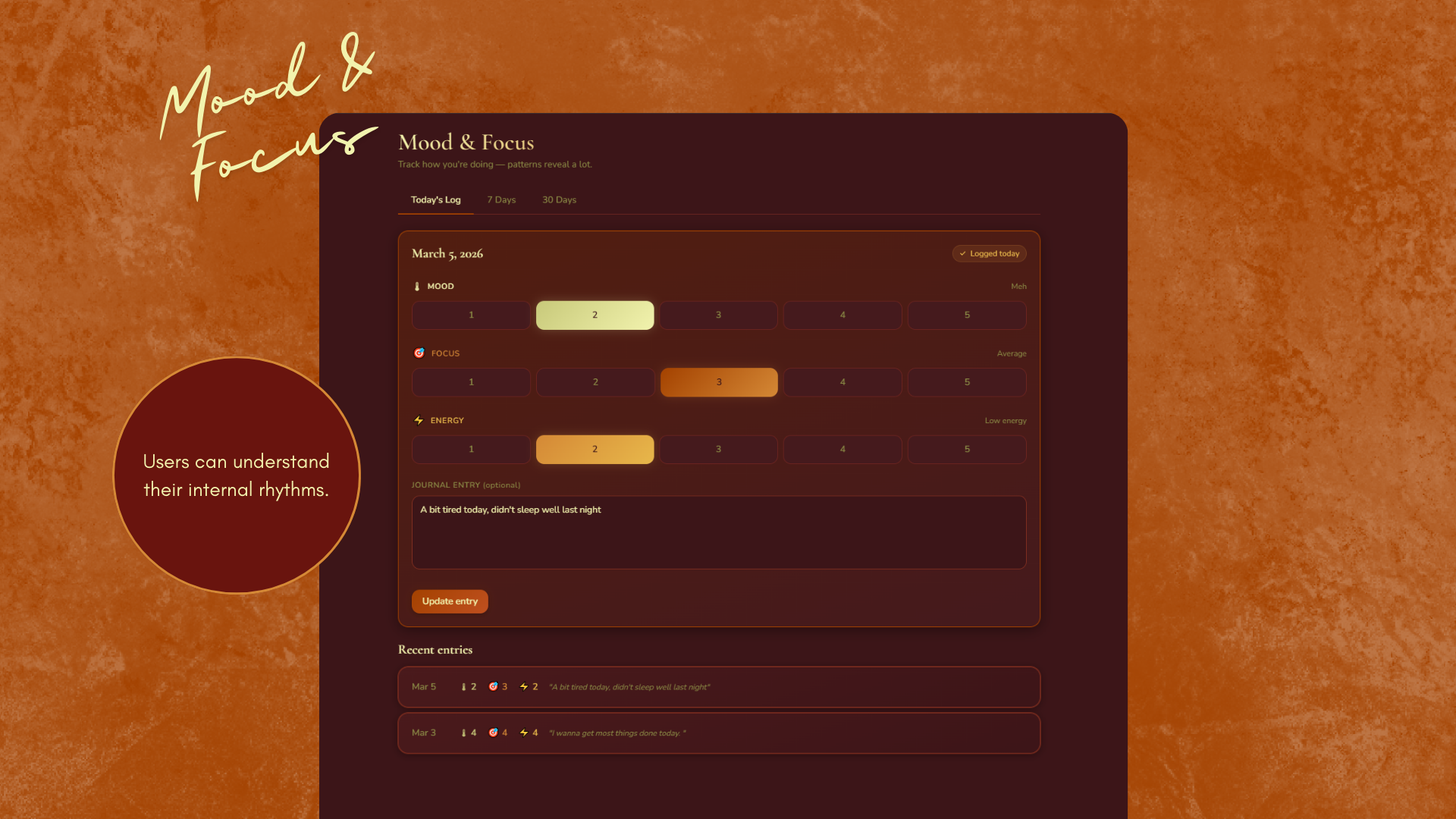
05 — Mood & Focus
A daily check-in for mood, focus level, and energy, paired with a free-form journal entry. The 7-day and 30-day graphs turn your logs into visible patterns, helping you notice when your energy dips weekly, or see the correlation between your focus and your sleep. Reflection becomes data without losing its humanity.
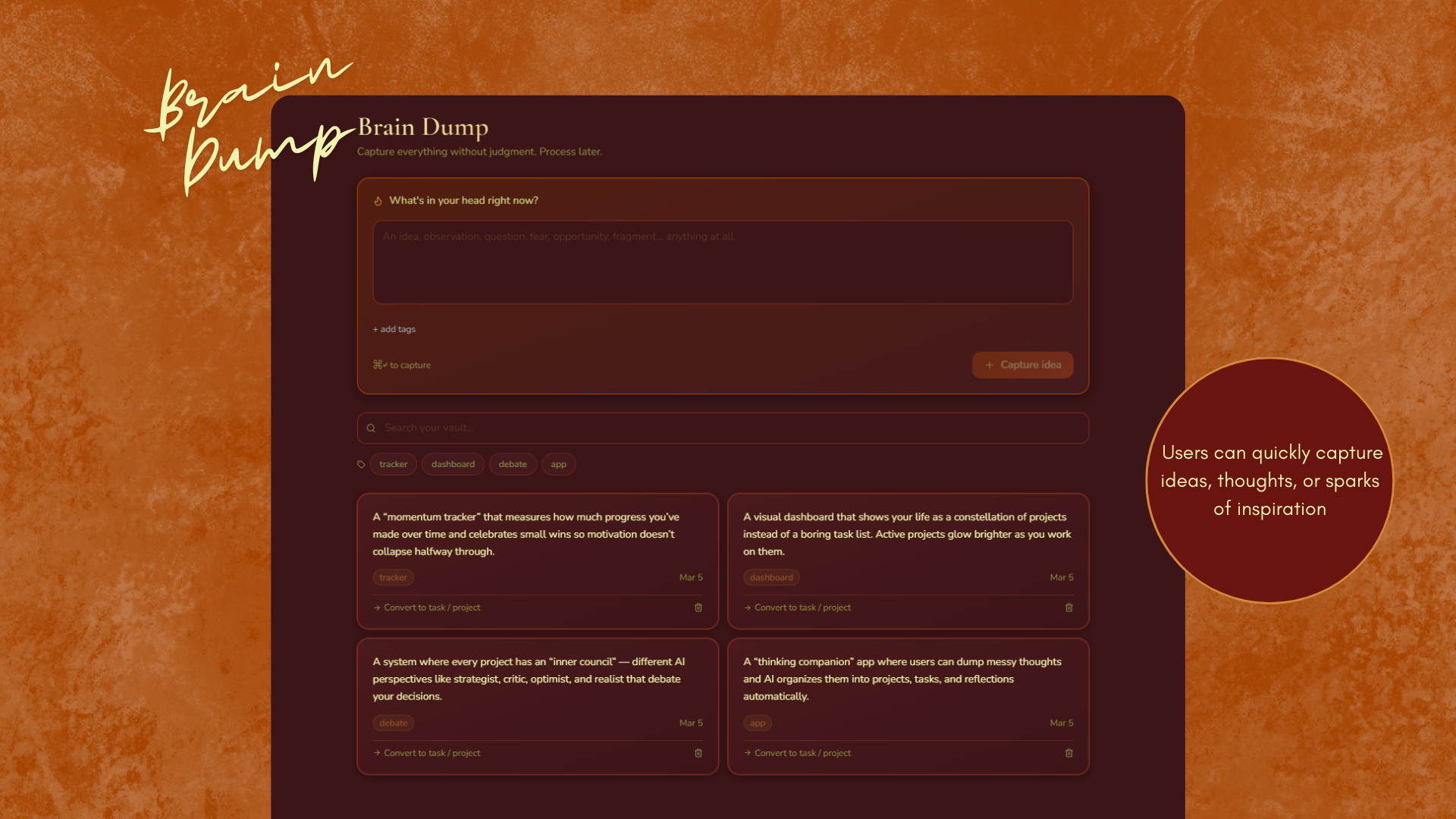
06 — Brain Dump
Capture anything, a project idea, a worry, a half-formed thought, without needing to organise it immediately. The Brain Dump is a pressure valve. When you're ready, you can convert any entry directly into a project or a task. Nothing is lost, nothing is forced into a system before it's ready.
Design System
Warm by design. Intentionally intimate.
Colour Palette
#3C1518
Deep Wine
#69140E
Border Red
#A44200
Burnt Orange
#D58936
Amber
#F2F3AE
Pale Cream
Typography
Nunito
Nunito's rounded terminals soften the interface and reduce cognitive tension, a deliberate choice for an app dealing with mental state and reflection.
Key Components
Energy level selector
Mood & focus check-in
Energy cost task badges
Inner Council voice cards
Project category pills
7-day & 30-day mood graphs
Brain dump capture input
Offline sync indicator
Outcome & Reflection
What this taught me about designing for the whole person.
Flowspace pushed me to think about design beyond the screen. The hardest problems weren't visual, they were conceptual. How do you represent energy without it feeling clinical? How do you make five AI voices feel distinct without making the interface feel cluttered? How do you design a Brain Dump that feels genuinely pressure-free?
The offline-first architecture was also a design decision, not just a technical one. It sent a message: this app is yours, even when you have no signal. Your data, your reflections, your Inner Council, all available regardless of connectivity. For an app about mental wellbeing and focus, that reliability felt essential.