Designing for civic accountability in the age of AI.
Role
Lead Designer
Type
Web Platform
Year
2024
Tools
Figma · Roboto
Overview
2
User types designed for
5
Core features
4-step
Reporting flow
Dual
Citizen + Admin views
When citizens speak, governments should listen.
Public Pulse is an AI-powered civic feedback platform designed for two distinct audiences simultaneously, the citizen filing a complaint and the government official trying to understand what their county most urgently needs.
The core challenge
Citizens face daily challenges with public services, but existing channels for reporting issues are fragmented, slow, and lack transparency.
The Problem
A broken feedback loop erodes public trust.
01
Fragmented channels
Citizens had no unified place to report issues. A pothole, a water shortage, an illegal structure, each went to a different ministry, phone number, or physical office.
02
Zero transparency
After filing a complaint, citizens heard nothing. No status updates, no timelines, no acknowledgment. The report disappeared into a void, breeding distrust.
03
No data for decision-makers
Authorities lacked aggregated, reliable data to understand where problems clustered or what the public actually felt about services. Decisions were made in the dark.
Design Process
Five stages. Two very different users.
Discover
I mapped the existing landscape of civic reporting, what existed, what failed, and why. I interviewed citizens who had tried to report issues and government staff who received them. The gap between both experiences was stark. Citizens felt unheard; officials felt buried in noise.
Define
Two user personas emerged: the Citizen (frustrated, time-poor, distrustful of institutions) and the Admin (overwhelmed with unstructured data, needing prioritisation tools). Any solution had to serve both meaningfully, or it would serve neither.
Ideate
The conversational reporting model was the key breakthrough. Instead of a cold form, the AI assistant guides citizens through a natural 4-step flow, what happened, where, any evidence, confirmation. It lowered the barrier dramatically while collecting structured data on the backend.
Prototype
I built both sides in parallel. The citizen-facing interface needed to feel approachable and human. The admin dashboard needed density and clarity, charts, filters, user management, without feeling overwhelming.
Validate
Usability testing revealed that the step-by-step progress indicator (Step 1 of 4) significantly reduced user anxiety. Citizens wanted to know they were almost done. On the admin side, the sentiment analysis view became the most-used feature, officials loved seeing public emotion mapped geographically.
Key Design Decision
"A form asks. A conversation listens. Replacing the report form with a step-by-step AI assistant wasn't just a UX choice, it was the product's entire value proposition reframed."
Selected Screens
Citizen-facing and admin designed as one system.
── Brand & Landing
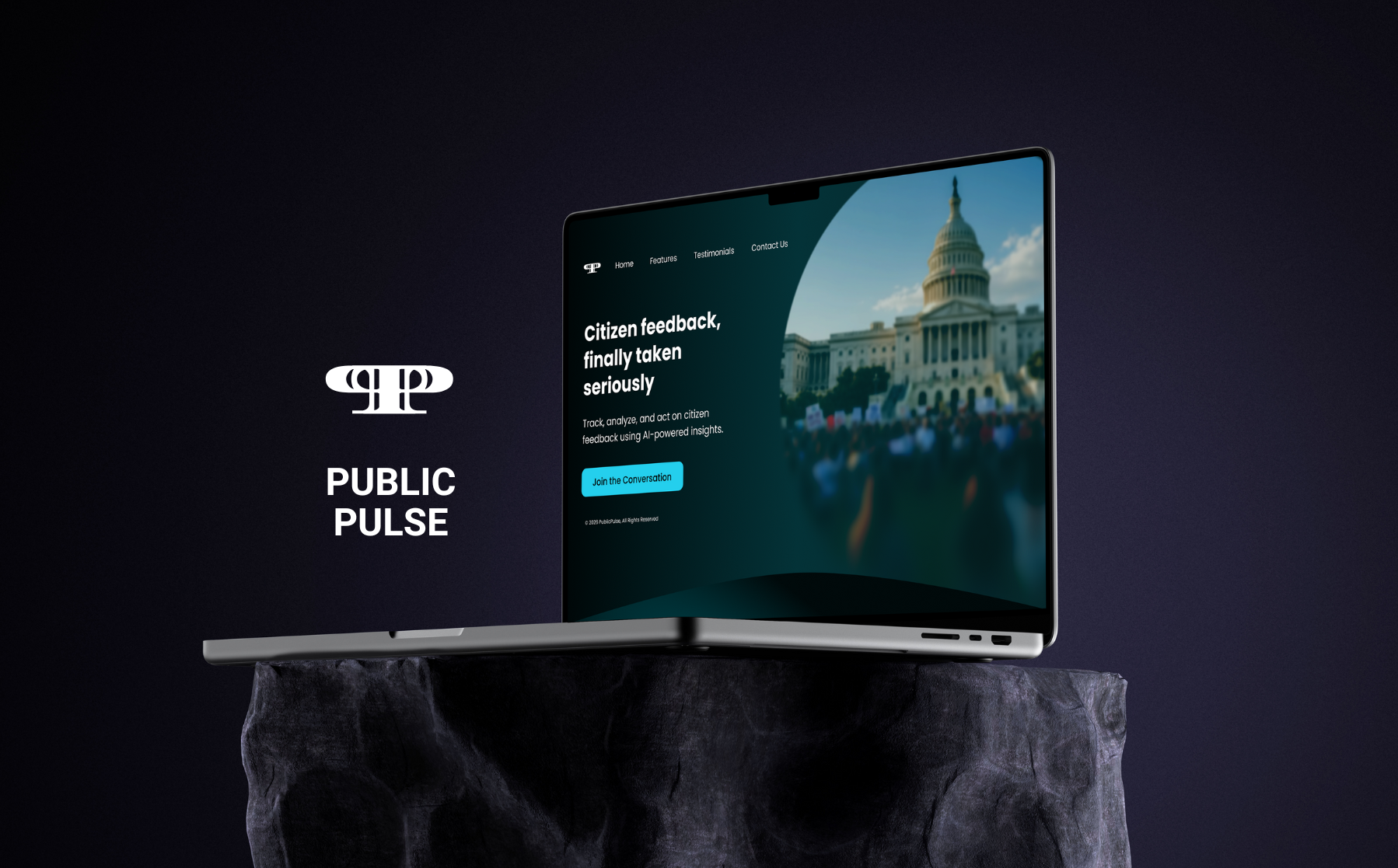
01 — Brand Identity
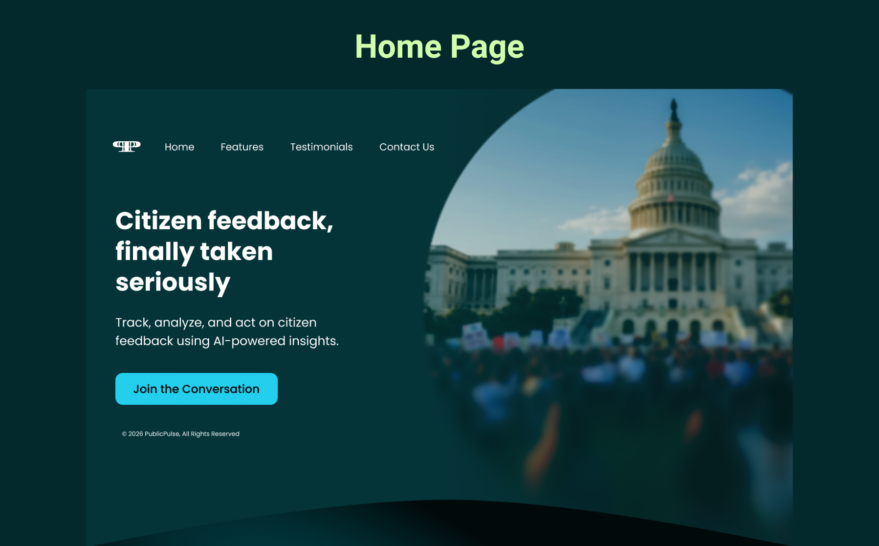
02 — Home Page
── Citizen-Facing Interface
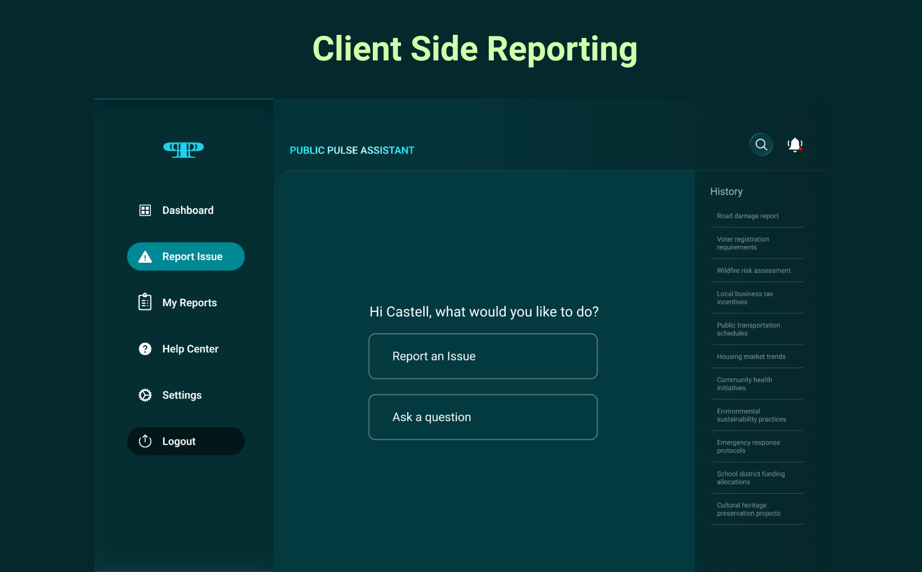
03 — AI Assistant
The entry point for citizens: not a form, a conversation. Two paths, Report an Issue or Ask a Question, keep the experience focused.
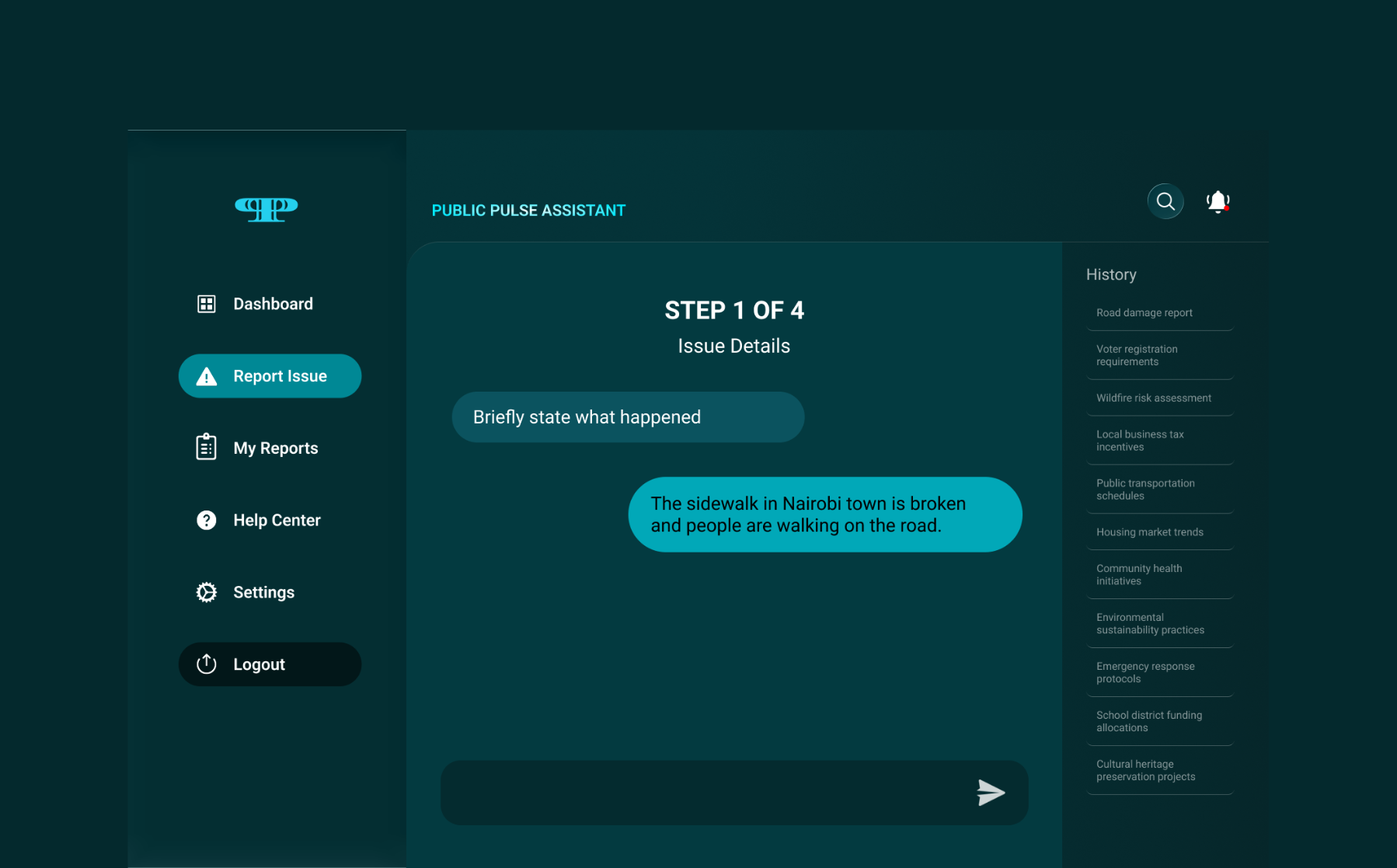
04 — Step 1 of 4: Issue Details
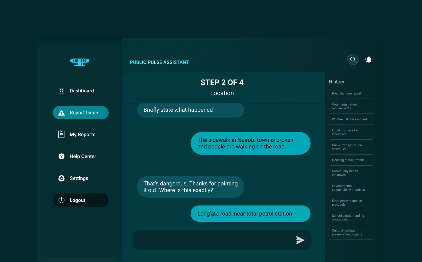
05 — Step 2 of 4: Location
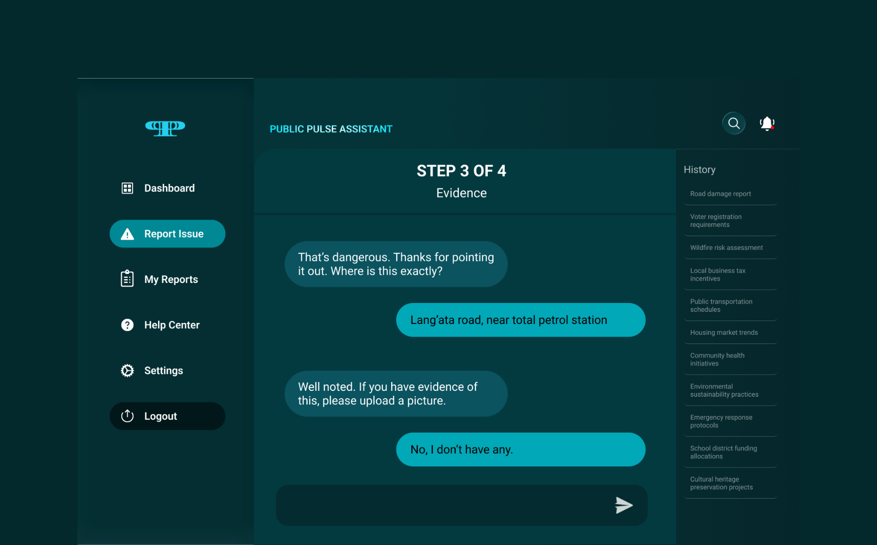
06 — Step 3 of 4: Evidence
Optional photo upload, the system moves on whether or not evidence exists. "No, I don't have any" is a valid answer. Removing this blocker was critical: many citizens abandoned earlier prototypes when evidence upload felt mandatory.
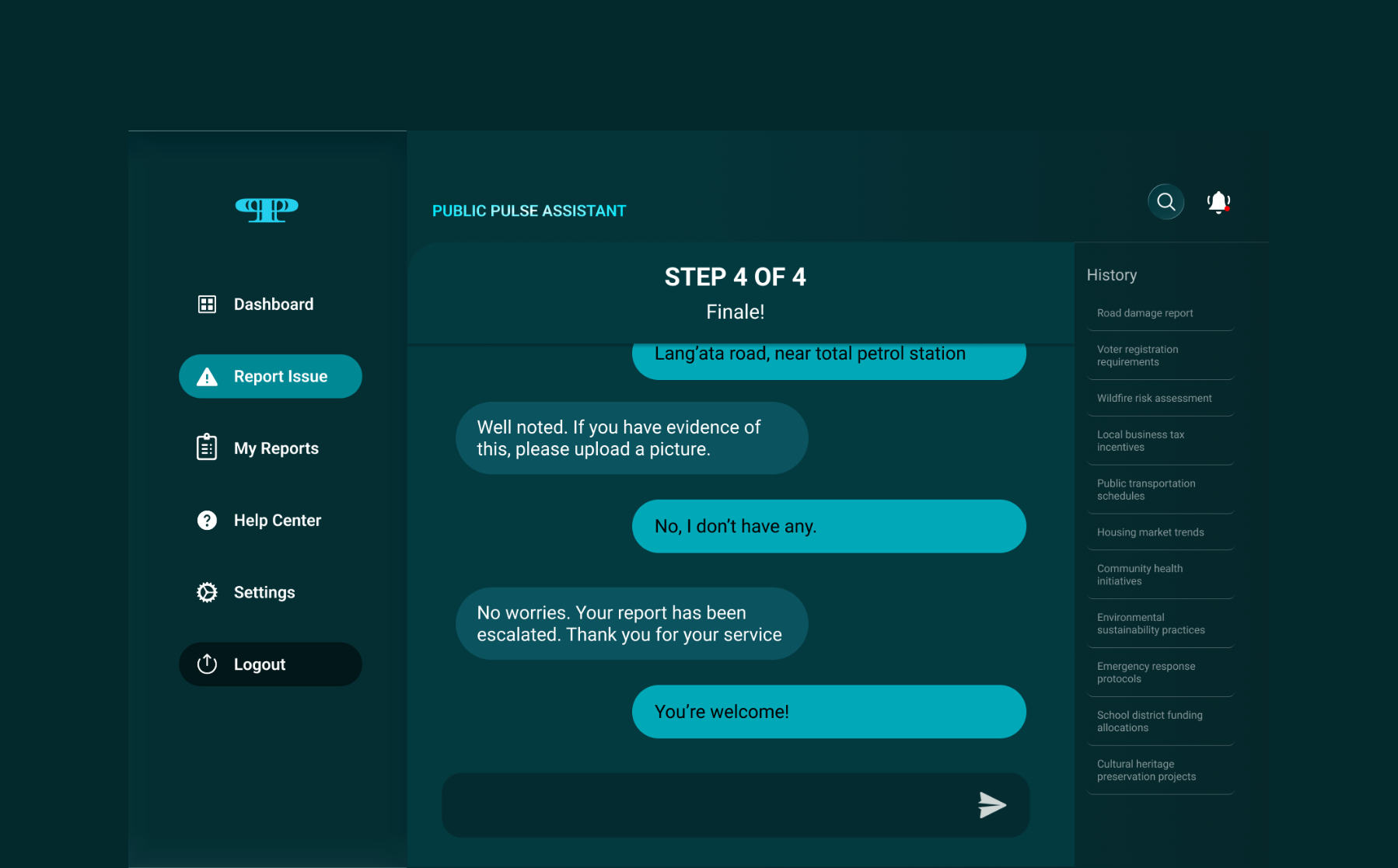
07 — Step 4 of 4: Escalation
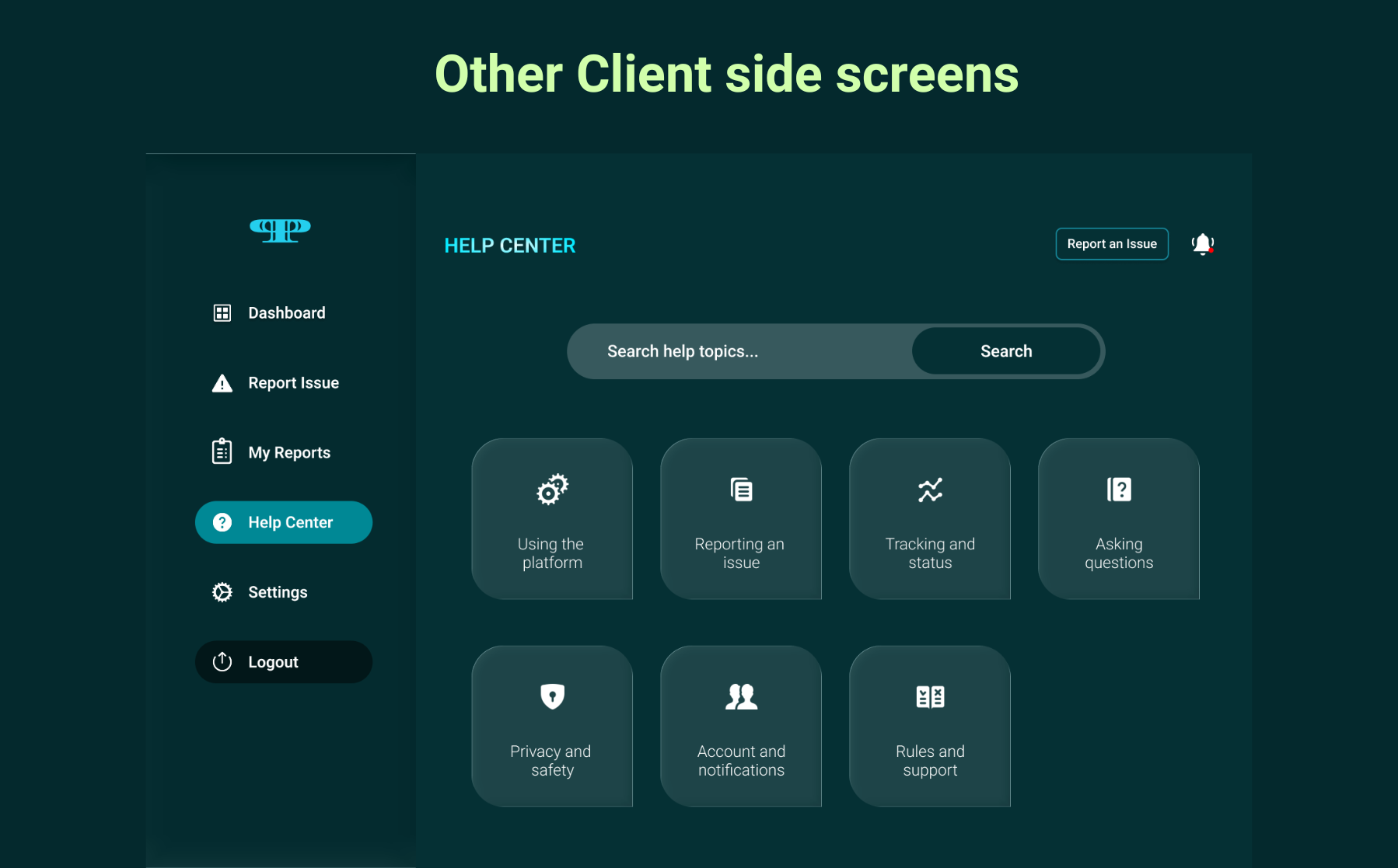
08 — Help Center
A self-serve knowledge base. Citizens can find answers to platform questions without opening a new report.
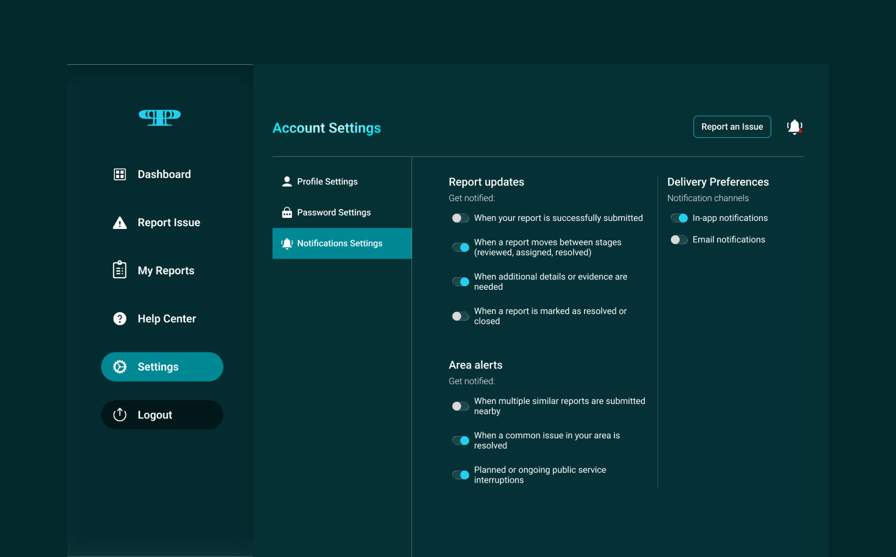
09 — Notification Settings
── Government Admin Interface
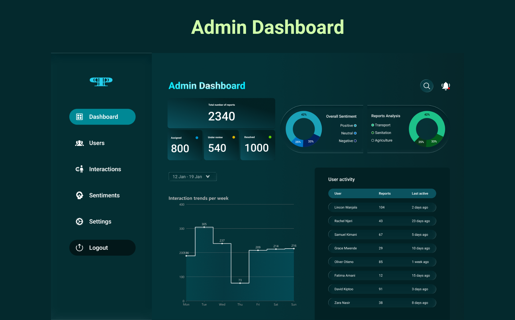
10 — Admin Dashboard
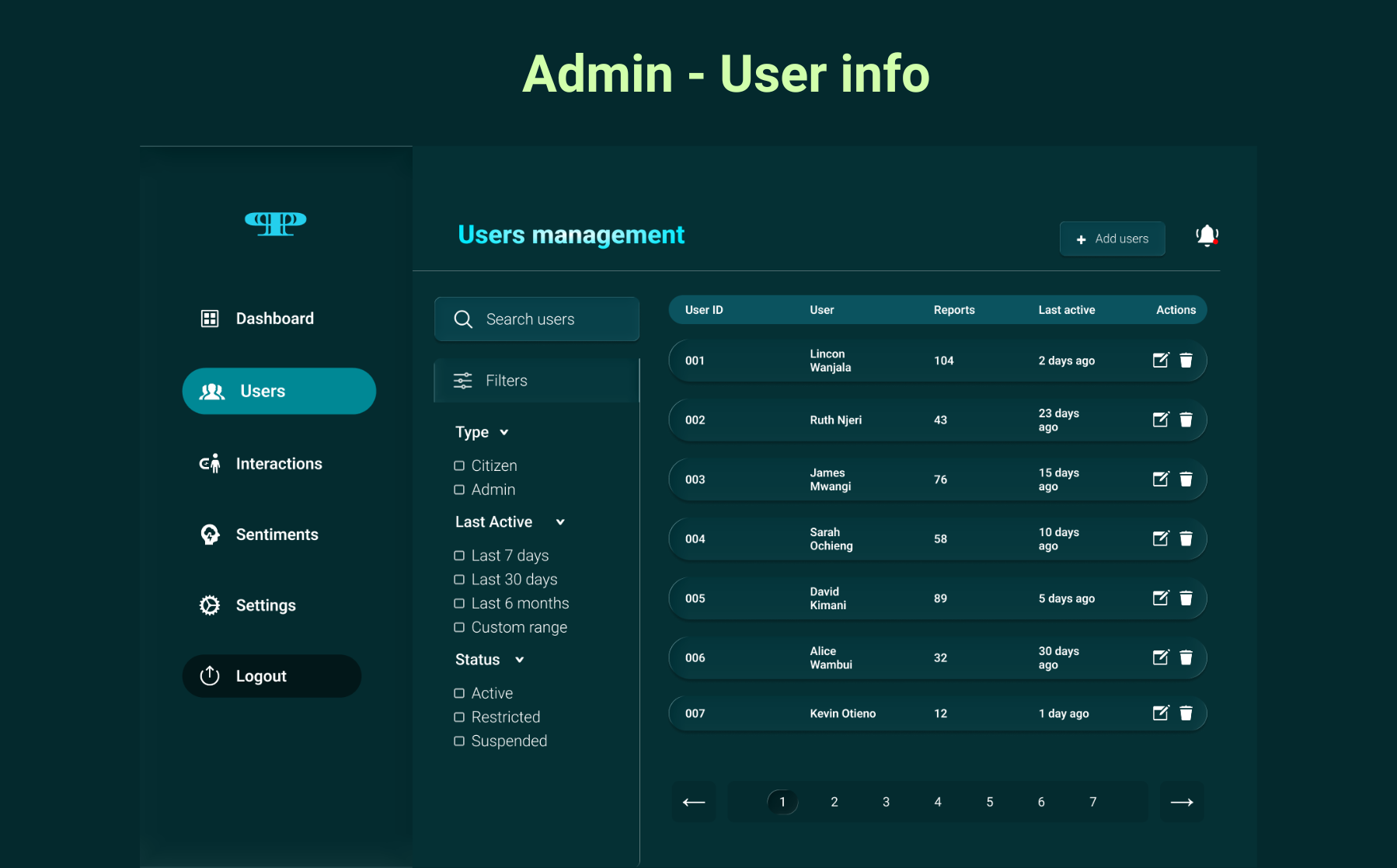
11 — User Management
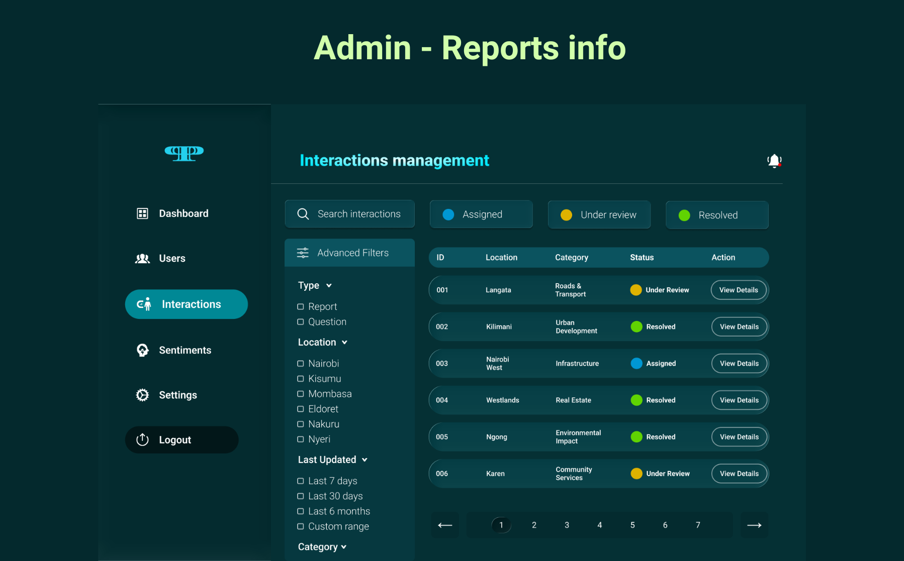
12 — Interactions Management
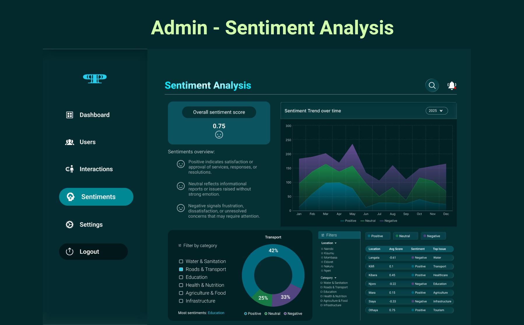
13 — Sentiment Analysis
Design System
A system built on trust and legibility.
Colour Palette
#053034
Deep Civic
#0B535F
Mid Teal
#008895
Action Teal
#F0F5F5
Off White
Typography
Roboto
Roboto was chosen for its civic clarity and democratic legibility, readable at every weight, on every screen, for every citizen.
Key Components
Conversational message bubbles
Step progress indicator
Status pills (Assigned / Review / Resolved)
Role-based navigation sidebar
Data visualisation charts
Toggle notification controls
Pagination system
Outcome & Reflection
What this project taught me about designing for power.
Public Pulse required me to hold two fundamentally different mental models in tension at once. Citizens needed warmth, simplicity, and reassurance that they'd been heard. Administrators needed density, control, and data they could act on.
The biggest lesson: designing for civic contexts means designing for trust. Every interaction either builds or erodes it. In government tech, there is no neutral.